Plan
In the previous part, we created the most basic blog possible. This skeleton is pretty bare-bones; we haven’t styled a single thing, and it shows.
Let’s be honest here: reading the posts isn’t fun nor pleasing to the eye. The stark contrast, full-page width, and weird mobile formatting will probably drive many people away. Me almost included.
Validation
I’ve never been an experienced front-end developer. Most of my professional career lies in back-end and hardware-level development. Of course, during my bachelor’s degree, we had classes that ranged from basic web development to more “advanced” “enterprise application” development using Java EE.
What I want to say is that I know the basics of HTML, CSS, and JavaScript and how they interact with each other. What I don’t know is the latest and greatest best practices.
As far as I remember, browsers are pretty lenient when it comes to interpreting and rendering HTML pages. Unlike a compiler, which will error out if you miss a single semicolon, a browser accepts a malformed HTML page and tries to render it as best as it can. It may not look like what you wanted, but at least it tried.
I fondly remember when a friend created his own website and used the <g></g> tag for making the text green.
Together with some CSS, this is actually possible, even though the <g> tag is only valid in an <svg>.
For now, I am going to use the Markup Validation Service from the World Wide Web Consortium (W3C) to validate the HTML structure of the published pages. I couldn’t find a working command line interface tool that does the same, so putting the published URL in there will have to do.
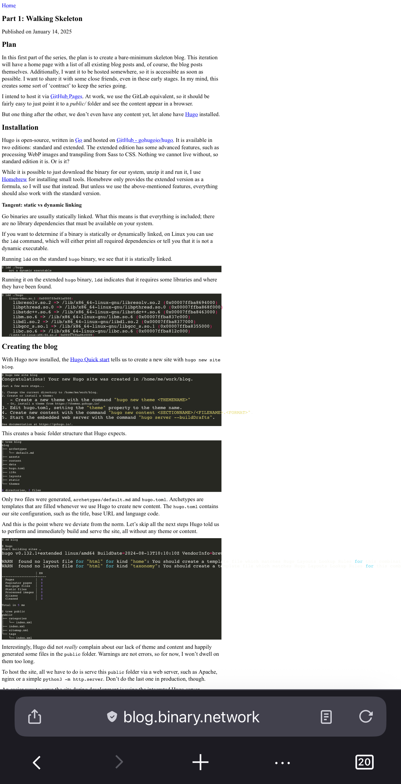
Validating my first published post already resulted in a warning and an error.
Warning: This document appears to be written in English. Consider adding lang=“en” (or variant) to the html start tag.
Error: Start tag seen without seeing a doctype first. Expected <!DOCTYPE html>.
The second error is interesting, as I have already seen it whenever I opened the developer tools in my browser, saying something like:
This page is in Quirks Mode. Page layout may be impacted. For Standards Mode use “<!DOCTYPE html>”.
The MDN web docs state about this ‘quirks mode’:
In quirks mode, layout emulates behavior in Navigator 4 and Internet Explorer 5. This is essential in order to support websites that were built before the widespread adoption of web standards. In no-quirks mode, the behavior is (hopefully) the desired behavior described by the modern HTML and CSS specifications.
I don’t think I need to support Netscape Navigator 4 or Internet Explorer 5, so let’s deactivate the automatic quirks mode by specifying the doctype as the first thing in our two existing layouts, index.html and posts/single.html.
While we’re at it, let’s also heed the warning about our document being written in English, and add the lang="en" attribute to the <html> tag.
<!DOCTYPE html>
<html lang="en">
.. snip ..
</html>
With this and an automatic refresh of the browser later, we are in no-quirks mode, and the validator has not found any additional warnings or errors.
Mobile and ‘Responsiveness’
One of the first issues I came across was when I opened the bare-bones blog on my phone. Just look at it:
On my desktop browser, the page always utilized the full width and resized properly. All this wasted space on the right makes me believe that some DPI shenanigans are going on. I remember that every responsive HTML template included some meta tags about the viewport and some initial scale being reset.
The “viewport” is actually a concept by Apple. Their Configuring the Viewport - Documentation Archive describes the entire concept and why it was created.
Back in the day when the first iPhone was released, webpages were not optimized to be read on a small screen. Safari on iOS defaulted its viewport width to 980 pixels and zoomed out to make the pages display, somewhat, how they were intended to be viewed.
So, to tell mobile Safari and other mobile browsers that we want to use the proper viewport size and not some ancient default, we set the following meta tag.
<head>
    <meta name="viewport" content="width=device-width, initial-scale=1.0">
</head>
This specifies that the viewport width should be equivalent to the device width and that it should not be zoomed by default. Specifying only the width means that the height will be inferred and also be correct when the device is in landscape.
At first glance, this looks a lot better.
But what the hell are those giant lines in the code block? Those also looked perfectly fine on my desktop browser. Checking with a spare Android phone, this issue does not seem to appear there too.
Apple shenanigans again?
Using the Safari remote web inspector, I did spot that the text gets bigger and bigger, but nothing that any weird styles were applied or anything.
With some Google-fu, literally just describing my issue as “safari ios text getting bigger”, I stumbled upon some Stack Overflow questions that perfectly described my issue.
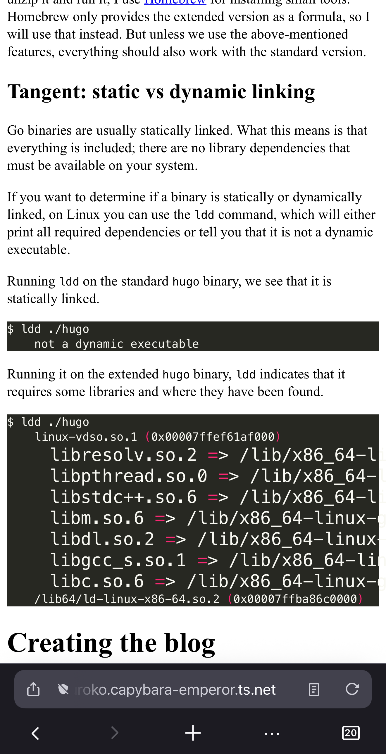
The reason? text-size-adjust or, more specifically, -webkit-text-size-adjust.
This CSS property is again a relic from the past, where mobile browsing was still emerging. The Customizing Style Sheets - Documentation Archive does not really describe this issue well:
Adjusting the text size is important so that the text is legible when the user double-taps. If the user double-taps an HTML block element—such as a <div> element—then Safari on iOS scales the viewport to fit the block width in the visible area. The first time a webpage is rendered, Safari on iOS gets the width of the block and determines an appropriate text scale so that the text is legible.
The text-size-adjust - CSS | MDN documentation describes it much better:
[…] Instead of laying out pages at the width of the device screen, they lay them out using a viewport that is much wider, usually 800 or 1000 pixels.
Since text that has been scaled down to fit a mobile screen may be very small, many mobile browsers apply a text inflation algorithm to enlarge the text to make it more readable. […]
Long story short, it is still a mystery to me why this text gets increasingly larger. Maybe it’s the way Hugo generates source blocks that the text inflation algorithm kicks in. Anyway, I don’t want any magic to happen to any text size, so let’s just fix it to 100%.
body {
    /* Disable text inflation algorithm on some 'small'-screen devices. */
    text-size-adjust: 100%;
    -webkit-text-size-adjust: 100%;
    -moz-text-size-adjust: 100%;
}
There is also a -moz prefix for Mozilla-based browsers.
Even though I haven’t noticed this issue happening in Firefox on a mobile device, I’ve added it to be on the safe side.
Next up, this funky overflow:
I edited the background to a light gray, to make it much more readable.
This one was pretty straightforward. The way Hugo generates source code blocks is as follows:
<div class="highlight">
  <pre tabindex="0" style="...">
    <code class="language-..." data-lang="...">
      <!-- bunch of spans -->
    </code>
  </pre>
</div>
So what we want to do is just make the <pre> tag scrollable in the horizontal direction if it overflows.
/* Make code blocks scrollable in the X axis */
div.highlight pre {
    overflow-x: auto;
}
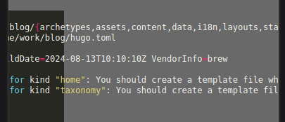
With all these changes, the layout is now bound to the viewport correctly: no more weird scaling, enlarging, or overflows.
Design
With the layout wrangled into the viewport, I think it’s time to make it look good passable too.
I’m a software engineer after all and not a designer.
First, the width.
On a desktop browser, the content is still stretched over the entire width of the monitor, and with the rise of ultra-wide monitors, this results in a not-so-fun reading experience. For now, let’s just limit the entire body to have a maximum width and some padding so the text does not touch the viewport edge.
body {
    /* Center style */
    padding: 1em;
    max-width: 850px;
    margin: 0 auto;
}
Next up, the font.
If you don’t specify any font at all, the default will be dependent on the browser used and the operating system. Additionally, various font properties, such as the height, can also vary across browsers.
The following screenshot shows the difference between Safari (left), Chrome (middle), and Firefox (right) on macOS:
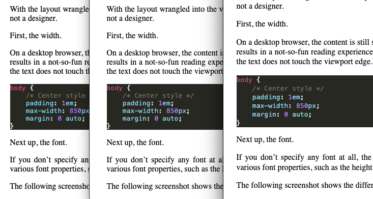
As we can see, the font height, or padding, is much larger in Firefox than in Safari and Chrome.
This in itself does not bother me, but what does is the serif font. While serif fonts are much more preferred for print media, sans-serif fonts are generally better for on-screen readability.
So let’s change it to a sans-serif font, specifically Roboto, a typeface family developed by Google.
The easiest way to include a Google font is to directly download them from their server fonts.googleapis.com.
Per their documentation, you just have to include these three lines in the <head> portion of your HTML.
<link rel="preconnect" href="https://fonts.googleapis.com">
<link rel="preconnect" href="https://fonts.gstatic.com" crossorigin>
<link href="https://fonts.googleapis.com/css2?family=Roboto&display=swap" rel="stylesheet">
To keep my blog as self-contained as possible, I just downloaded the Roboto font directly and put the Roboto-Regular.ttf into the static/ directory of my Hugo repository.
This way it just gets served as a static file, similar to the CSS file; no connection to an external server needed.
Configuring the font face is fairly simple, pretty much just taken from the official Google documentation.
What wasn’t included was the src: attribute.
The src - CSS | MDN documentation says that it “specifies the resource containing font data” and can be a list of multiple resources.
In this case, I have configured it to first check if the Roboto font is installed locally before fetching it over the network.
Interestingly, some browsers may ignore user-installed fonts when using local() to prevent fingerprinting and tracking.
body {
    /* All fonts lead to Roboto */
    font-family: "Roboto", sans-serif;
}

@font-face {
    font-family: "Roboto";
    font-optical-sizing: auto;
    font-style: normal;
    font-variation-settings: "wdth" 100;
    font-weight: 400;

    src: local("Roboto"),
         url("/Roboto-Regular.ttf") format("truetype");
}
With this, we now have a sans-serif font for all text.
Afterword
I think it’s fine to call it good for now. The blog is now properly readable on a mobile device, and many quirks have been ironed out. I still believe it feels a little lackluster and boring, but at least it isn’t totally unstyled for now.
There are still a few things I’d like to add: first, a proper color theme for light and dark mode. I’m a big fan of the Catppuccin colors, so I may nab the colors from there.
Second, the images are still a bit difficult to differentiate from the background and still in the PNG format. The second part is probably going to require some deep dive into the Hugo Pipes feature to build up some automatic resizing and conversion to a different file format.
Third, that tangent blurb in Part 1? I would like to convert that into an ’external’ note and link it, similar to the structure of org-roam or Obsidian.
There are a lot more features I have in my head and written down somewhere else, but as I stated in the introduction to all this, you aren’t gonna need it. Probably.