Plan
Now that the website is readable, it is time to fill it with content. But writing blog posts is hard and takes a long time, as you can see by the publishing dates between Part 1 and Part 2. Yes, that is from January until November. Now granted, it didn’t take that long to write everything; it’s more that I didn’t make myself the time. Additionally, I hold myself up to a much higher standard for regular posts. So making it understandable, readable, and presentable takes a fair bit of time for me.
So wouldn’t it be great to have a much simpler, low-stakes way of posting something on here? Something that doesn’t need a lot of editorializing and researching and can be just a few sentences?
Yes, dear reader, that’s precisely what we are going to do in this post.
That’s only half the reason I want something shorter, though. I will be away on a language vacation between March and July in Japan, and I want something to publish my progress, experiences, and thoughts somewhere.
Finally, because naming is hard, let’s just call them blurbs. The Cambridge Dictionary defines a blurb as:
a short description of a book, movie, etc., written by the people who have produced it and intended to make people want to buy it or see it.
I think experiences and thoughts qualify under the etc., it is written by the person who has produced it, yours truly, and it is definitely intended to make people see it. Intended to make people buy it? I think we can all agree that the internet is already full enough of advertisements.
Types
To differentiate between regular, long-form blog posts and shorter blurbs, we can just create a new folder under the content directory with a new name.
Before, we have written posts, but that is just a conventional name for the default type when you create a new Hugo site.
We could have named that anything else.
So let’s just create a new content/blurbs folder, stick a new markdown file in there, and see what happens!
content/blurbs/2026-01-05-hello-blurb/index.md:
+++
title = 'Hello Blurb'
date = 2026-01-05
summary = 'More than just a sentence.'
+++

Hello, this is the first ever 'blurb'!
It’s just there. Menacingly!
But when we navigate to it, Hugo has no way of knowing how to render this new type.

That’s because we have not yet created the appropriate layout for this new type.
To the zero people who are also creating a blog this way, you may have noticed an old warning resurfacing:
WARN found no layout file for “html” for kind “page”: You should create a template file which matches Hugo Layouts Lookup Rules for this combination.
Remember back when we set up the Walking Skeleton, we had to define a layout for posts.
So let’s do that, but for our new blurbs.
Since a post and a blurb are so similar, I just copied the layouts/posts/single.html to layouts/blurbs/single.html.
With a restart of Hugo later to read the new layout structure and a refresh, our blurb is visible.
Template Types
Looking into the layouts folder, we have a total of three layout files, all specifying the whole HTML template every time.
This may be fine in the beginning, but imagine I want to change the header.
Because the header is specified in every template, I would need to propagate this change over all three files, which is prone to errors and, more importantly, not fun.
Template Types to the rescue!
The Base type serves as a foundation layout that all other layouts build upon. This is the perfect use case for the overall HTML structure, so let’s create one:
layouts/baseof.html
<!DOCTYPE html>
<html lang="en">
    <head>
        <title>{{ .Title }}</title>
        <meta name="viewport" content="width=device-width, initial-scale=1.0">
        <link rel="icon" type="image/svg+xml" href="/favicon.svg" />
        <link rel="stylesheet" href="/style.css" />
    </head>
    <body>
        <div class="header">
            <a href="/" class="header-title">{{ .Site.Title }}</a>
        </div>
        <div class="content">
            {{ block "content" . }}
            {{ end }}
        </div>
    </body>
</html>
The baseof.html layout defines the general HTML structure and, where the content lives, an aptly named content block.
We can now change our home page index.html, posts/single.html and blurbs/single.html to define such a content block with only the content itself.
No more specifying the entire HTML structure.
layouts/index.html
{{ define "content" }}

<h1>Welcome</h1>
{{ range site.RegularPages }}
<div class="post-card">
    <h3>
    <a href="{{ .Path }}">{{ .LinkTitle }}</a>
    </h3>
    {{ .Summary }}
</div>
{{ end }}

{{ end }}
Since we have changed nothing in the base template and the content, the entire site looks completely identical.
The magic is for the future; if we want to change the header layout, we would only need to make a single change in the base layout, and the change is visible on all pages.
Home Page
Since blurbs should be more frequent in nature, I would like to separate them from the long-form blog posts on the home page.
Hugo lists everything under the content folder as a RegularPage, so we need to check the .Type property to filter them.
Luckily there is a where operator on collections where we can do exactly that.
Combining that with range, we can easily iterate over all pages that are of a specific type.
layouts/index.html
.. snip ..

<h2>Short-form Blurbs</h2>
{{ range (where site.RegularPages "Type" "blurbs") }}
  ... // This 'Page' is a blurb
{{ end }}

<h2>Long-form Blog Posts</h2>
{{ range (where site.RegularPages "Type" "posts") }}
  ... // This 'Page' is a regular post
{{ end }}

.. snip ..
With that, we have separated the short-form blurbs from the long-form posts.
Blurb Styling
With the blurbs now appearing, all that is left is to style them a bit more appropriately.
I want every blurb to have some sort of banner image that is displayed at the top and on the home page.
So in the blurb layout, let’s add one:
layouts/blurbs/single.html
{{ define "content" }}

<figure class="banner">
    <img src="{{ .Params.bannerName }}" alt="{{ .Params.banner }}" loading="eager" />
    <figcaption>
        {{ .Params.banner }}
    </figcaption>
</figure>

<h1>{{ time.Format "January 2, 2006" .PublishDate }}: {{ .Title }}</h1>

{{ .Content }}

{{ end }}
.Params.bannerName and .Params.banner are custom parameters, so each blurb can specify them in their frontmatter.
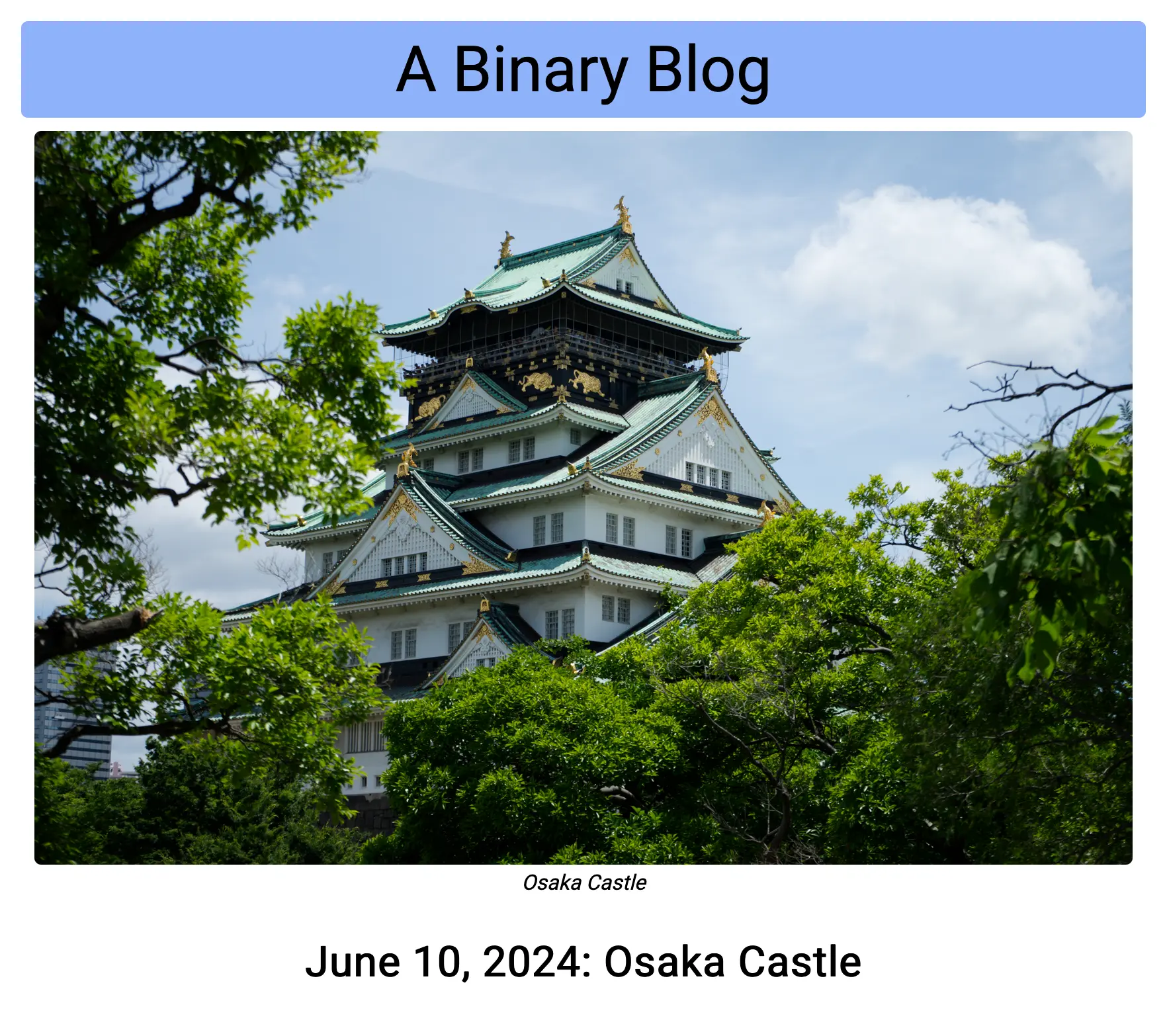
+++
title = 'Osaka Castle'
date = 2024-06-10
summary = 'One of the many famous castles in Japan'
[params]
    banner = 'Osaka Castle'
    bannerName = 'DSC05951.jpg'
    location = 'Osaka Castle, Chūō-ku, Osaka'
+++
With this, we have a basic image with a caption displayed on every blurb.
It does look good, doesn’t it? But that’s only when you have a super-fast internet connection.
The image alone is a whopping 21 megabytes!
That specific image was taken with a Sony ILCE-7M2, better known as the a7 II. A total of 24MP will do that to you. Since then I have upgraded to the a7 IV, which boasts a full 34MP. A JPG image from that camera, converted through Affinity Photo 2, weighs almost 30 megabytes. So what we need to do is to both scale it down and convert it to an even better format than JPG.
Luckily, Hugo has a Process method we can call on an image. With this, we can resize and convert it to the WebP format in one command.
layouts/blurbs/single.html
{{ define "content" }}

{{- $image := .Resources.Get .Params.bannerName -}}
{{- $webp := $image.Process "resize 1800x webp" }}

<figure class="banner">
    <img src="{{ $webp.RelPermalink }}" alt="{{ .Params.banner }}" loading="eager" />
    .. snip ..
</figure>

.. snip ..

{{ end }}
The 1800 pixel width was chosen somewhat arbitrarily. Initially, I picked the same width as the body of the HTML, 850px, but the images were extremely blurry. In hindsight, that’s obvious: a CSS pixel is not the same as a device pixel. So I just doubled it and slapped another 100 pixels on it.
I might need to tweak this in the future, but with this, the Osaka Castle image is now only around 300 kilobytes.
Because the source image lies in the same folder as the blurb itself, Hugo automatically copies it over to the output folder, even if it is not referenced.
Specifying publishResources = false will only copy resources that have been referenced.
+++
.. snip ..
[build]
    publishResources = true
.. snip ..
+++
Another cool feature is reading the Exif data from the image to include in the caption.
Hugo automatically reads these tags and can be access via the Exif property.
layouts/blurbs/single.html
{{ define "content" }}

.. snip ..

<figure class="banner">
    <img src="{{ $webp.RelPermalink }}" alt="{{ .Params.banner }}" loading="eager" />
    <figcaption>
        {{ .Params.banner }}
        {{ with $image.Meta.Exif }}
        {{ if .Model }}
        <br>
        {{ .Model }}, {{ .LensModel }}, f{{ lang.FormatNumber 1 .FNumber }}, ISO {{.ISO}}, {{.ExposureTime}}
        {{ end }}
        {{ end }}
    </figcaption>
</figure>

.. snip ..

{{ end }}
The with keyword binds the context to the given value.
In this case we can reference the Exif directly with the dot . instead of having to specify the full path like $image.Meta.Exif.LensModel. The additional line with the parameters is only displayed when we have a Model defined.
I found that the FNumber, the f-stop, was specified as a fraction, such as 28/5.
With a simple call to lang.FormatNumber 1 we output that fraction as a ’normal’ number with one decimal place.
Home Styling
With the blurb itself styled, it’s on to the home page.
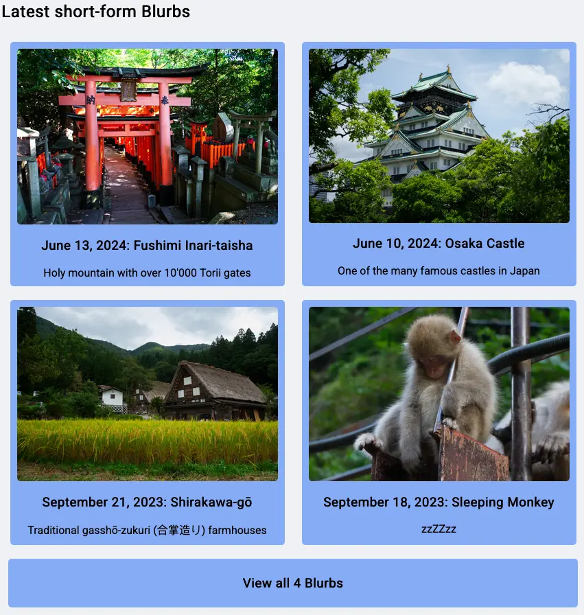
This will be fairly simple; just a section where the latest blurbs are being displayed as some sort of a card. We can already distinguish between blurbs and regular posts on the home page, so all it takes is to limit it to four blurbs, style the cards accordingly, and a link to all blurbs available.
layouts/index.html
.. snip ..

<h2>Latest short-form Blurbs</h2>
<div class="flex-container">
{{- $blurbs := (where site.RegularPages "Type" "blurbs") -}}
{{ range first 4 ($blurbs) }}
<a href="{{ .Path }}" class="blurb-card unstyled-link">
    {{- $image := .Resources.Get .Params.bannerName -}}
    {{- $webp := $image.Process "resize 850x webp" }}
    <img src="{{ $webp.RelPermalink }}" alt="{{ .Params.banner }}" loading="lazy" />
    <h3>
        {{ time.Format "January 2, 2006" .PublishDate }}: {{ .LinkTitle }}
    </h3>
    {{ .Summary }}
</a>
{{ end }}
<a href="/blurbs" class="all-card unstyled-link">
    <h3>View all {{ len $blurbs }} Blurbs</h3>
</a>
</div>

.. snip ..
The HTML structure is fairly simple.
Instead of directly iterating over all blurbs, we save them to the $blurbs variable.
We need all of them to properly fill out the text of the link to the /blurbs page.
Most of the magic lies in the various CSS classes.
static/style.css
.unstyled-link:link,
.unstyled-link:hover,
.unstyled-link:visited,
.unstyled-link:active {
    text-decoration: none;
    color: black;
}

.flex-container {
    display: flex;
    flex-wrap: wrap;
    justify-content: space-around;
}

.blurb-card {
    display: flex;
    flex-direction: column;
    align-items: center;

    background-color: lightskyblue;
    border-radius: 5px;
    margin: 10px;
    padding: 10px;
}

.blurb-card img {
    width: 380px;
    border-radius: 5px;
}
unstyled-link just disables all default decorations and colors of a <a> link.
Without this, all the text inside a card would be underlined and blue.
Not a great look for ‘plain’ text.
flex-container, or rather display: flex, is the bread-and-butter for responsive web design.
It’s everywhere.
The MDN Flexbox documentation describes it pretty succinctly.
Flexbox is a one-dimensional layout method for arranging items in rows or columns. Items flex (expand) to fill additional space or shrink to fit into smaller spaces.
While the blurb-card themselves do not specify a size, the img inside is set to a little less than half of the entire body width, 850px, to allow for a two-column design on a wide screen.
Whenever the screen width can no longer contain two blurbs next to each other, they automatically arrange themselves in a one-column design.
That is the power of flexbox.
The blurb-cards themselves are also flexboxes, to keep everything as a centered, one-column design.
With some border radii and some color, we get a fairly simple section that displays the latest four blurbs as a card.
List Page
With only the last 4 blurbs showing on the home page, we have already created a link to /blurbs displaying all of them.
For this to work, we need a new template type, namely the List type.
We could have also used the Home, but I don’t think list is deprecated, and I like the naming better.
The list template itself is super simple. Instead of only displaying the first four blurbs, we iterate over all of them, displaying the same cards as we have in on the home page.
Yes, there is some blatant copy-paste going on, but I’ll let it slide for now. I can live with changing two spots at the same time.
layouts/blurbs/list.html
{{ define "content" }}

<h2>All short-form Blurbs</h2>
<div class="flex-container">
{{ range (where site.RegularPages "Type" "blurbs") }}
<a href="{{ .Path }}" class="blurb-card unstyled-link">
    {{- $image := .Resources.Get .Params.bannerName -}}
    {{- $webp := $image.Process "resize 850x webp" }}
    <img src="{{ $webp.RelPermalink }}" alt="{{ .Params.banner }}" loading="lazy" />
    <h3>
        {{ time.Format "January 2, 2006" .PublishDate }}: {{ .LinkTitle }}
    </h3>
    {{ .Summary }}
</a>
{{ end }}
</div>

{{ end }}
Afterword
With this, we have successfully implemented blurbs!
For now I just took four photos I took from previous vacations I really liked and just put them as one. No real content for all of them, as they are only here to demonstrate the layout.
I hope I find the time to write some more meaty blurbs in the future during my language exchange.