Plan
For the entirety of my professional career, I have been writing backend code; frontend is something I have dabbled in during my studies and now here with this blog. Lately I’ve been working on a private full-stack project involving a .NET backend and a React frontend.
I can work my way around frontend code; actually, I am still learning a lot working on this project. If you are using React in your projects, take a look at the Tanstack libraries. They are super high quality and provide a great developer experience.
What I am still struggling with is design. Especially modern web design that looks good and is responsive. Here’s where the title of this blog post comes in handy: Tailwind CSS.
Tailwind
Tailwind is a utility CSS framework, meaning it provides utility classes like flex, p-4, text-xl, etc.
Each class provided is minimal, essentially similar to writing inline CSS using the style attribute.
Naturally, this sparks some debate on whether it is actually useful or not.
Tailwind themselves have a short paragraph about this exact question.
I have found it to be quite ergonomic to use, and even I, a software engineer who embodies the meme version of graphic design is my passion, can quickly design a website that both looks good and is responsive.
So let’s use Tailwind for my blog.
Hugo already provides a function called css.TailwindCSS, including a tutorial on how to set up everything.
Thank you, Hugo; very cool.
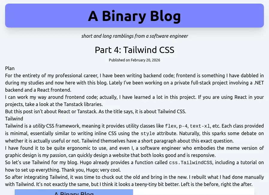
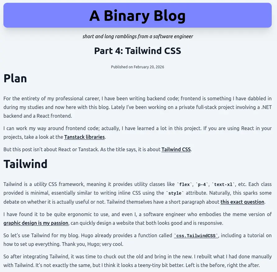
So after integrating Tailwind, it was time to chuck out the old and bring in the new. I rebuilt what I had done manually with Tailwind. It’s not exactly the same, but I think it looks a teeny-tiny bit better. Left is the before, right the after.
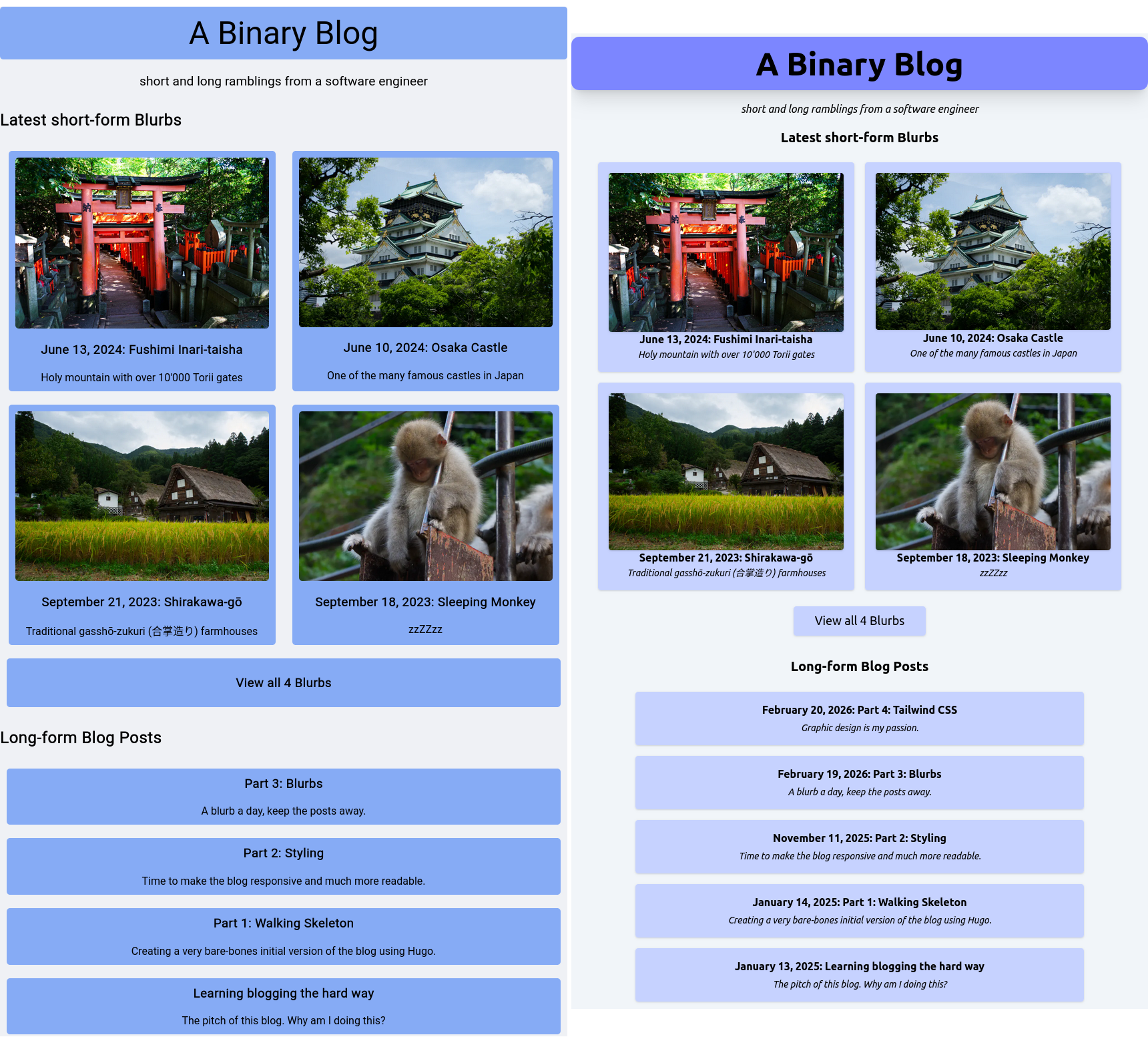
The title is more pronounced, most of the colors are a bit lighter, and all in all, I feel it’s a bit more cleaner. I don’t know how to describe it better. I also added some subtle shadows to the card components so they stand out a little. With this, I feel they look like something you can click on.
Partials
Back in Part 3: Blurbs I wrote:
Yes, there is some blatant copy-paste going on, but I’ll let it slide for now. I can live with changing two spots at the same time.
With Tailwind, I do not have a blurb-card class anymore.
I could recreate it and use the @apply directive to reference the Tailwind classes, but there is a better way.
That is the Partial template type.
If you’re familiar with any modern web framework, such as React, Angular, Vue, and CURRENT_HOT_FRAMEWORK, a partial is essentially a reusable component.
Thanks to the Hugo Tailwind integration, we already have a partial component implemented, the layouts/_partials/css.html.
Let’s create our own blurb-card.html partial.
layouts/_partials/blurb-card.html
<div class="m-2 w-xl rounded bg-indigo-200 p-4 shadow-sm lg:w-sm">
    <a href="{{ .Path }}" class="flex flex-col items-center">
        {{- $image := .Resources.Get .Params.bannerName -}}
        {{- $webp := $image.Process "resize 850x webp" -}}
        <img
            class="rounded shadow"
            src="{{ $webp.RelPermalink }}"
            alt="{{ .Params.banner }}"
            loading="lazy"
        />
        <div class="text-center">
            <p class="font-semibold">
                {{ time.Format "January 2, 2006" .PublishDate }}:
                {{ .LinkTitle }}
            </p>
            <p class="text-sm italic">
                {{ .Summary }}
            </p>
        </div>
    </a>
</div>
Now we have a component that takes a blurb-structure as input and renders a card div.
We can now use this partial in both layouts/index.html and layouts/blurbs/list.html.
layouts/index.html
.. snip ..

<div class="flex flex-wrap justify-center">
    {{- $blurbs := (where site.RegularPages "Type" "blurbs") -}}
    {{ range first 4 ($blurbs) }}
        <!-- render the partial and provide the current context -->
        {{ partial "blurb-card.html" . }}
    {{ end }}
</div>

.. snip ..
With this, if I want to change the design of a blurb card, I can change it in one place and the changes are reflected everywhere. This wasn’t such a problem before with a single or two CSS classes, but with Tailwind you don’t want to copy-paste your classes around similar components.
Tailwind Typography
With the HTML now styled with Tailwind, how do we style the Markdown content? Since Hugo is the one that converts the Markdown into HTML, we don’t have a good way to inject Tailwind CSS classes into all components.
Luckily there is Tailwind Typography.
The official Tailwind CSS Typography plugin provides a set of prose classes you can use to add beautiful typographic defaults to any vanilla HTML you don’t control, like HTML rendered from Markdown, or pulled from a CMS.
If you’ve followed the Tailwind integration on the official Hugo docs, Tailwind Typography is already included.
With this, we have access to the prose utility class, which styles everything inside according to their defaults.
layouts/posts/single.html
{{ define "content" }}
    <div class="prose flex max-w-none flex-col space-y-2">
        <h1 class="text-center text-3xl">{{ .Title }}</h1>
        <span class="text-center text-xs">
            Published on
            {{ time.Format "January 2, 2006" .PublishDate }}
        </span>
        <article
            class="prose-p:text-justify prose-img:drop-shadow-xl prose-img:mx-auto"
        >
            {{ .Content }}
        </article>
    </div>
{{ end }}
We put the prose class on the div outside to also style the h1 containing the title and the span with the publish date. prose also defines its own max-width, which conflicts a bit with my body max-width, so we can just override it with max-w-none.
To style components inside the prose, we can use the prose-{component}: modifier.
As seen above, we can justify the text inside a p with prose-p:text-justify.
Since the blurb and post articles are fairly similar, I tried to combine them into a single layout.
But since one has a big image and their titles are a little bit different, one has the publish date included the other doesn’t, I opted to go back to the previously mentioned @apply directive.
With this, I can create a bb-prose-article class that applies the prose-specific styles I want.
assets/css/main.css
@import "tailwindcss";
@plugin "@tailwindcss/typography";
@source "hugo_stats.json";

.bb-prose-article {
  @apply prose-p:text-justify prose-p:my-3;
  @apply prose-img:drop-shadow-xl prose-img:mx-auto;
}
I can apply this class to both <article> tag in the layouts/posts/single.html and layouts/blurbs/single.html to make sure they both look identical.
Afterword
I like using Tailwind.
It takes some time to learn the class names, but with a bit of p-, m-, flex, and colors, you can do a lot quickly.
And the results don’t even look half bad.
You can argue that it removes some personality because Tailwind provides a lot of default values out-of-the-box, which will be the same for every website that uses it. But for me, this is actually a plus, since I don’t have to fine-tune every single thing.
Oh, and remember text-size-adjust from Part 2: Styling?
Yeah, I checked; Tailwind automatically sets it to 100%.
One could say, I would have never experienced that this even exists.
But really, I don’t remember it being fun to debug that one.
One thing missing that I still need is displaying the Exif data for all images in a blurb, not just the header image. I’ve already made it work with a custom shortcode. Maybe I’ll describe that in a future post or blurb, but it’s so simple, I may leave this as an exercise to the reader.